A study of statistics from Ontario’s electricity market over the long term sheds light on some of its key qualities. Brian Rivard, the IESO’s Manager of Regulatory Affairs & Sector Policy Analysis, outlined some noteworthy findings from his work in recent years. His presentation, titled “Facts, Figures And Trends From Ontario’s Electricity Market,” was delivered at the IESO Stakeholder Summit on March 4.
Mr. Rivard began by noting that there is much to consider with data of this nature. For example: what can be done to better ensure that the market sends more accurate price signals? Or, what are the opportunities for new technologies such as storage and DSM for responding to the kind of price volatility that is predicted in the future?
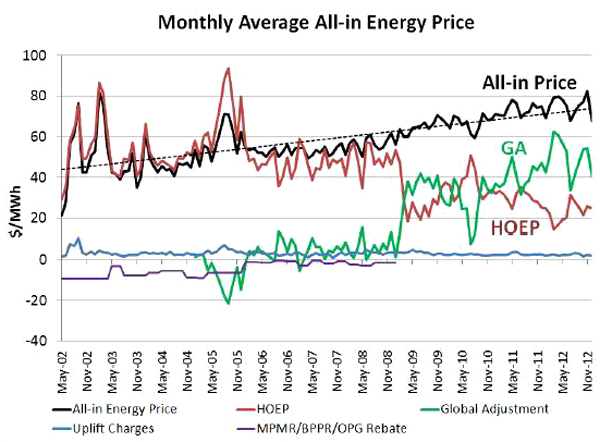
One of the first areas to examine is of course the trends in prices over the long term. In Ontario, since the wholesale market opened in 2002, all-in costs have risen around 4.6 percent per year, much faster than inflation (see graph above). Of course, as noted elsewhere, the Global Adjustment has grown much faster than the commodity cost of electricity during this period. One of the more challenging findings is that marginal price is often below average price. Rivard observed that a situation of this nature suggests, at least in terms of economic theory, that the system is often under-utilizing its resources.

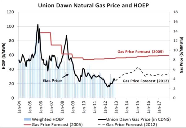
Although not particularly surprising, it is evident from the history of market prices that there is a strong correlation between natural gas prices and HOEP, the hourly price. Aside from those times when baseload generation is adequate, gas fired generation is frequently on the margin, setting the clearing price.
Another observation with potential relevance to future market mechanisms is the comparison between off-peak and on-peak prices. The differential between on peak and off peak has declined since market opening. Rivard says this is largely explained by lower natural gas prices, softening demand patterns and a stronger supply base. However, despite this general trend, ramping peaks are steeper than they were before. The increasing amount of wind capacity on the system will likely create needs for additional ramping. These observations may be of particular interest to people concerned about using the value available in peak prices to finance market-driven investments in supply or DSM.
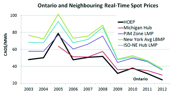
Comparing Ontario market prices with those in neighboring jurisdictions shows imperfect but reasonably close alignment (see figure above). Nonetheless it is worth asking whether there are opportunities to improve efficiency by reducing seams issues or having more frequent offers at the inter-ties.
Observation of market behaviours like these may help market participants to deal with pending questions such as how do we send signals to attract the kind of technologies we think are likely to be needed? To what extent can market participants rely on market prices to do this work?
No doubt there are many more insights that can be gleaned from further study of this kind of data.


